FCC Broadband Label Integration
OVERVIEW
This project focused on implementing the FCC ruling requiring internet service providers to display broadband consumer labels at the point of sale. These labels needed to contain critical information about service offerings with “close proximity” to an advertised offer, which created multiple challenges we’ll get into below. The main pieces to this project included designing the label itself, modifying the existing internet and mobile buyflows to accommodate showing the new label, creating a new “label hub”
TEAM
KJ Jena / UX Designer, Kathryn LaPann / Lead UX Designer
Stefan Backhaus / Creative Director, Susannah Statyr / Product Manager, Jonathon Connelly / Dev lead.
Prototype
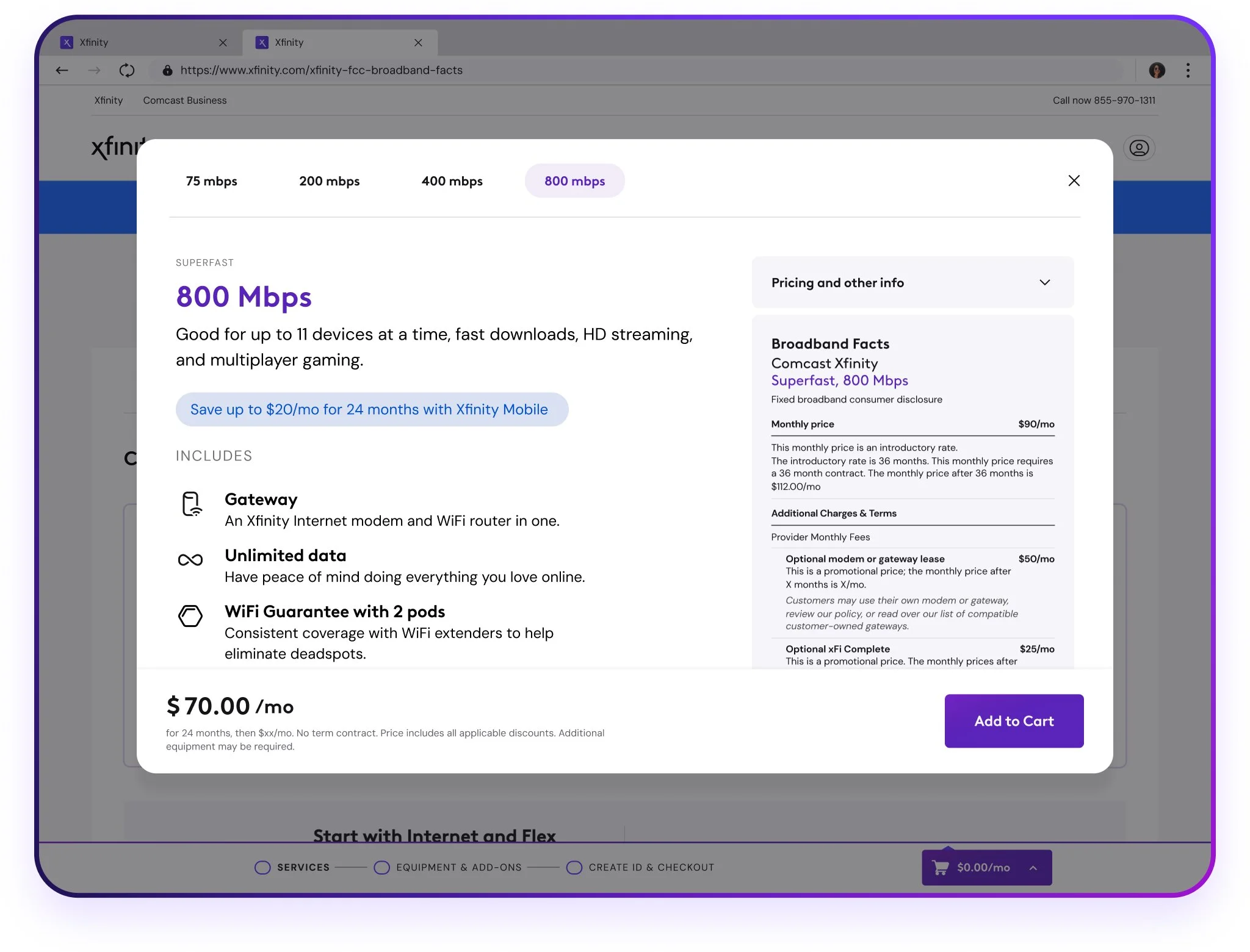
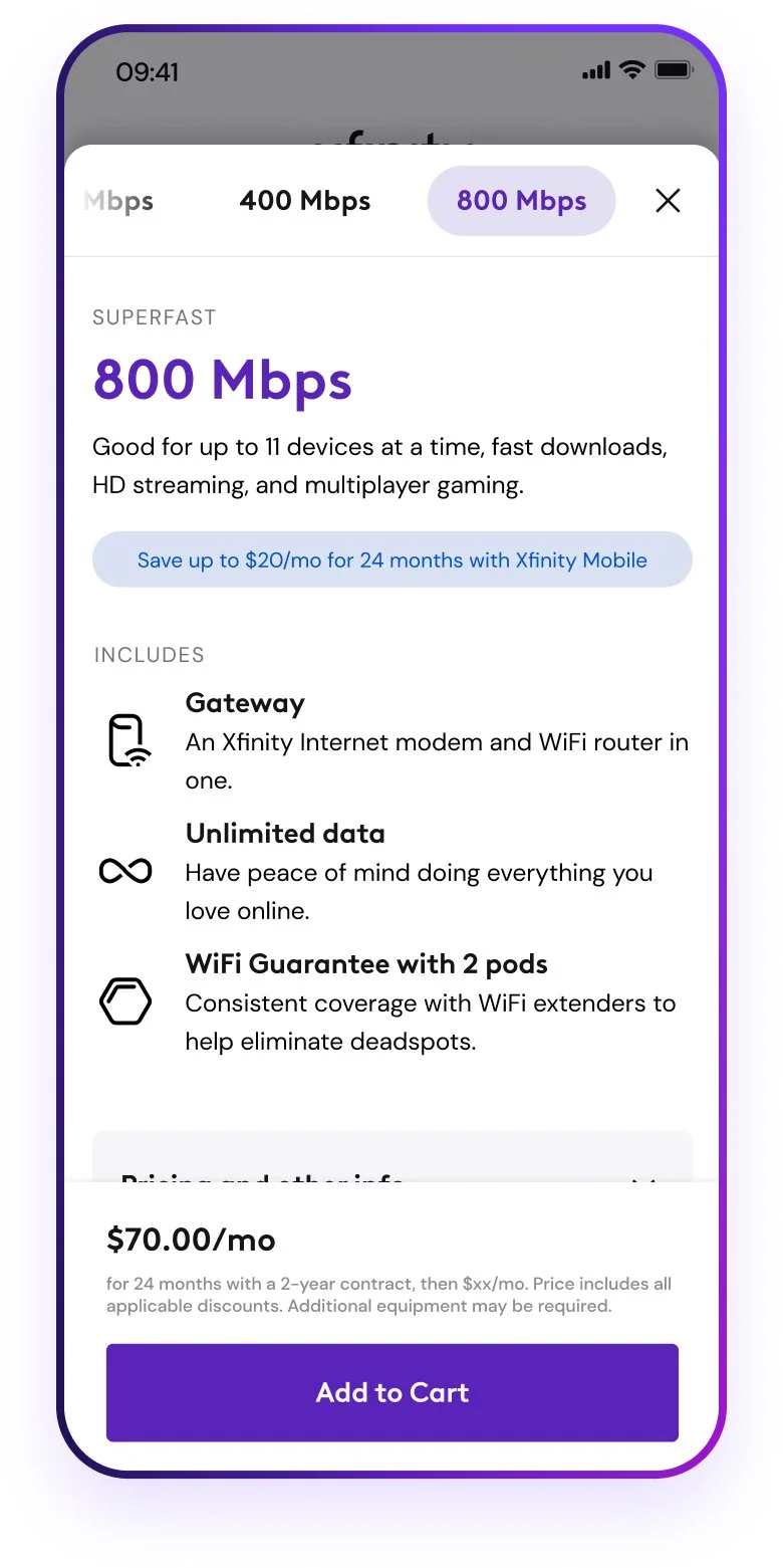
Here’s a quick look at the final product. We implemented a new interaction pattern for selecting an internet speed tier in order to accommodate showing the broadband label at the point of sale. Instead of clicking the speed tile to add to cart, clicking instead opens a modal with more information about the speed tier, and a scrollable label. Users can view the label and learn more about each speed tier all in one view. Keep scrolling to learn more about how the design got here.
The Challenge
-
Ambiguity + conflicting stakeholder interests
The mandate from the FCC left some room for interpretation which made navigating conflicting business and legal interests a particular challenge for the design. The mandate noted the labels need to be present in “close proximity” to the point of sale, without any other context. While legal interpreted this as next to any “add to cart” button or functionality, the business was hoping to maybe hide the label under a dropdown or some other interaction. Legal is of course always more comfortable taking the safe route as to not be found out of compliance and incurring a fine, where the business was hoping to be a little more risky and not show too much information that may dissway potential customers which would result in lower conversion rates and ultimately less revenue. A classic conflict.
How this particular challenge was navigated was through a lot of iteration. How many different options can I possibly come up with and which ones will there be some overlap for these two conflicting interests? Ultimately my iterations were narrowed down to two options that we then took to moderated A/B testing to hear from users first-hand and let the research speak for itself. We’ll get into the research more below.
Once a direction was chosen the next challenge was altering the way customers add services to their cart, which is a hugely important and risky moment to tamper with. Due to the importance of this project and the amount of dev resources allocated to it we were able to swing for the fences on this one and re-evaluate how we approach this vital interaction.
-
Goals
Comply with FCC mandate to include broadband facts at any point of sale.
De-emphasize the prominence of the broadband labels.
Add learn content at the point of sale to help users convert.
Surface the most relevant information on the labels for users to easily access and digest
The Research
Going into this project it was clear that adding a label to the point-of-sale was the piece with the highest impact to the current experience, so I started there. After a few rounds of iteration I identified the two strongest directions to test, with insight from my creative director and fellow designers.
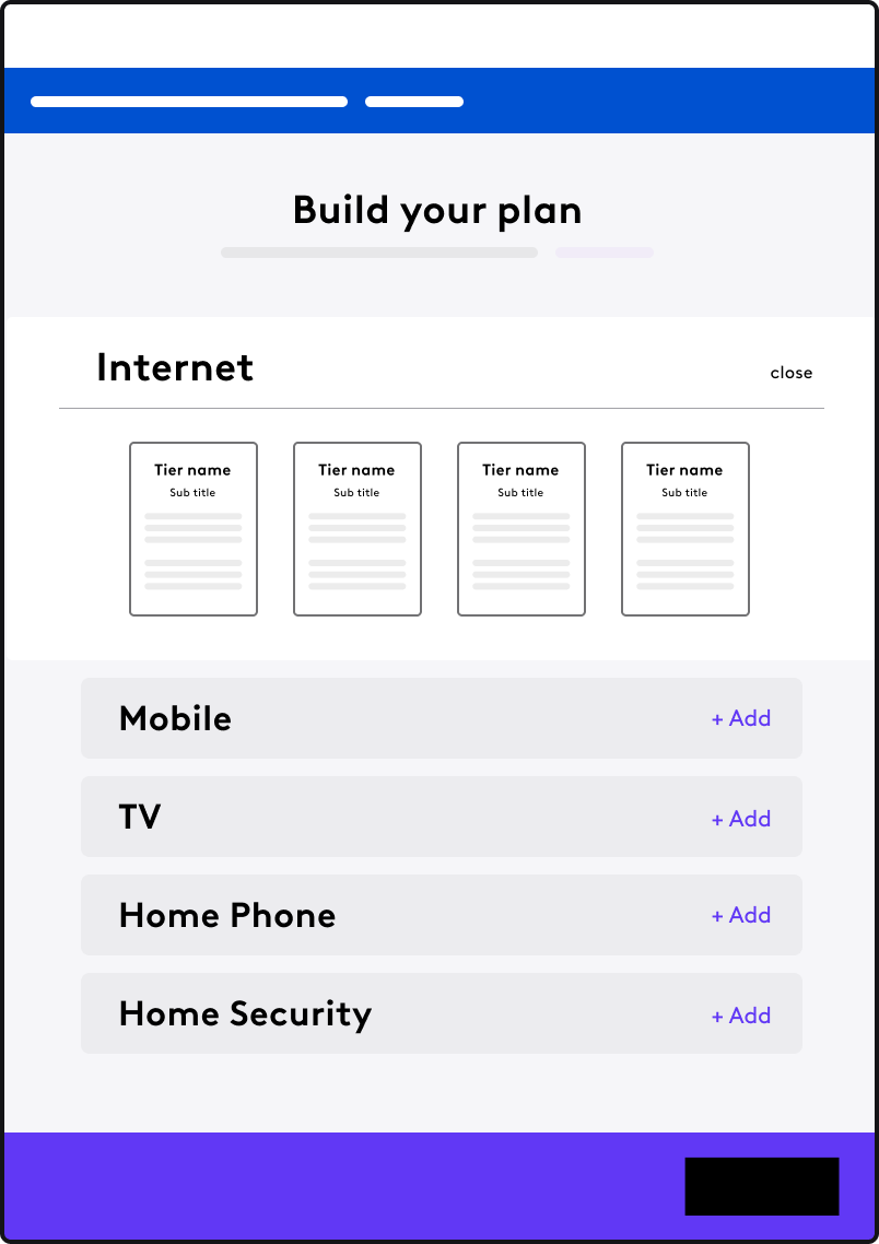
The two designs showcased the same information (the label and some bullet points about each internet speed tier) but differed in the interaction pattern which brought it to the surface. The current experience at the time included crowded speed tier tiles that when clicked, immediately added to cart. Both of the new directions start with clicking a speed tier. One direction opened a dropdown within the same page, where the other opened an overlay modal with the new information and a separate add to cart CTA.
Dropdown Concept
Modal Concept
With these two directions in place I then built them both out into high fidelity prototypes to put in front of users. We set up a moderated A/B test with help from the customer insights platform Suzy to recruit users and schedule interviews and began testing.
Our objectives were fairly simple:
Which interaction pattern will users find the easiest to navigate?
How will users react to seeing the information on the label?
Assumptions:
Users will want to see the information on the label but might find it overwhelming.
Users will like having the added learn content about each tier of service.
Results
After going through the interviews and synthesizing the results it was clear the the modal approach was the strongest design for us to move forward with. The dropdown relied on an anchor link that was sometimes disorienting to the user, and depending on how many offers were showing at one time the original speed tile that was clicked would be out of frame which caused some confusion as well. Users indicated liking seeing more information about each tier of service and as moderators we noticed there was more room with the modal to display them without things feeling crowded. Below are a few insights taken from the synthesis of our research.
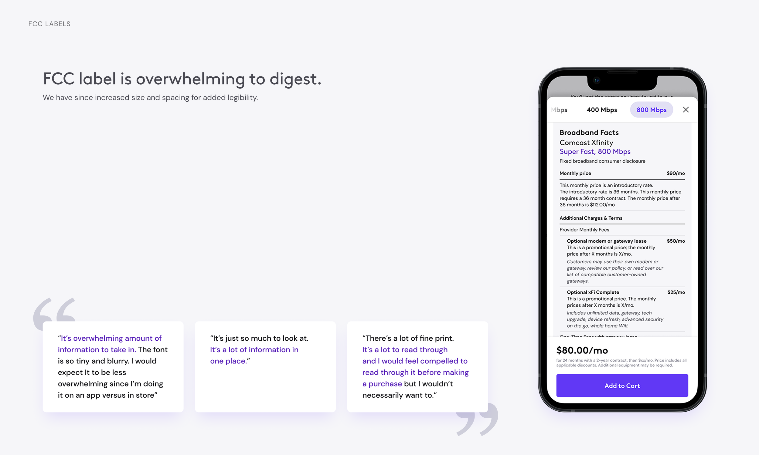
As expected, users found the information on the label useful, but also overwhelming. Moving forward we knew we needed to increase the size and spacing within the label to help with legibility.
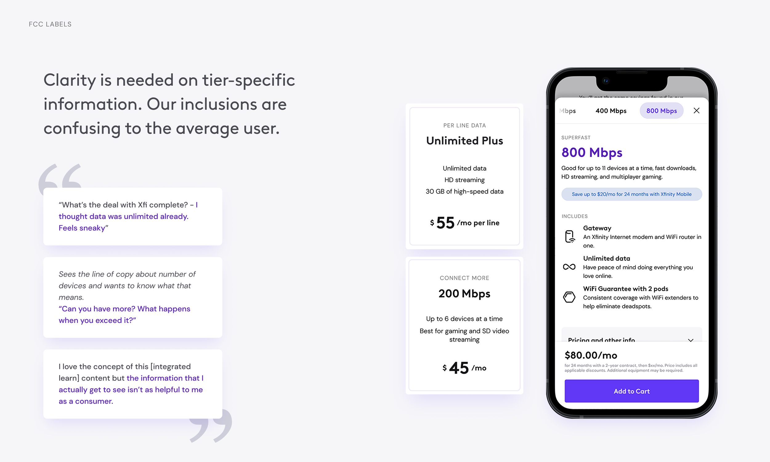
An unexpected outcome was that yes, users liked seeing more information about each tier of service, but the more info we gave them the more opportunities there were for users to be confused about what it meant. This caused us to take more time to work with our copy/content partners to look at how we talk about each service and make sure we aren’t just throwing lingo around that doesn’t make sense to the user.
Key Features
-

Improved buyflow
Adding a modal interaction pattern to the buyflow to accommodate the broadband label also allowed for more learn content to be present the purchase moment. This gives users more confidence in what they are selecting as well as the ability to compare options.
-

Net new label hub
As part of the FCC mandate, Xfinity needed to create one public facing central location to house all of the new labels across offerings. This new page needed to store a lot of information in a clear, easy to read way resulting in a heavy emphasis on information architecture in it’s design.
Integrated learn content
By adding a modal interaction to the purchase moment instead of simply clicking a tile to add to cart we opened up a lot more space to add learn content about each offering. Historically users would need to backtrack to the learn section of the site in order to understand the products in more detail. Now they can shop for services, learn about them, compare them to one another, and add to cart without leaving the page and still having the label in full view.
Promotional capabilities
Along with more space for integrated learn content, the modal allows for additional promotional capabilities which was a big win for our business unit who has goals centering around combined offer connections. The previous speed tiles could fit an abbreviated blue pill referencing the potential savings extended to users who bundle internet and mobile together, while the modal allows for more context and even stacking of pills for multiple promotions running at the same time.
Label Hub
Meeting the FCC label mandate required a centralized solution for managing all labels. I designed the Label Hub to provide a clear and organized repository for all label iterations across Xfinity and Xfinity NOW. The primary challenge was creating an intuitive information architecture that would allow users to quickly locate specific label versions as needed without being overwhelming.
Reflections
Meeting the FCC label mandate for Xfinity.com required balancing competing priorities and managing limited resources. The resulting solution—a scalable label design, a dramatic shift in the buyflow to accommodate it, and a net new label hub—reflects these considerations. One of the most challenging aspects was navigating the varying perspectives of the business unit, legal team, and developers. The business unit was concerned about the impact of the label on conversions, the legal team prioritized compliance above all else, and the development team had limited bandwidth to implement new features. Successfully navigating these constraints required careful negotiation and prioritization. For instance, we had to make trade-offs regarding the placement and size of the label to minimize disruption to the user flow while still meeting legal requirements. With additional time, I would have conducted more user research to gather data to support design decisions and facilitate discussions with stakeholders, particularly around calming the nerves around our business unit partners. This case study illustrates my approach to tackling complex projects with multiple stakeholders and regulatory constraints, and I’m really proud of the result overall. We were able to meet the needs of everyone involved and also elbowed in some improved transparency that will empower customers to make the best choice for themselves.


